Creating a Resume That Stands Out with Visuals
Why Visuals Matter in Your Resume
In today's competitive job market, a visually appealing resume can set you apart. Recruiters often sift through countless resumes, and a well-designed document can catch their eye and keep their attention. Using visuals helps convey information more effectively, allowing your skills and experience to shine.
Design is the silent ambassador of your brand.
Think of your resume as a first impression; you want it to be memorable. Visuals can help create a narrative around your professional journey, making it easier for hiring managers to connect with you. A balance of text and visuals can break up dense information and lead to better retention of your details.
Moreover, leveraging design elements can demonstrate your creativity and attention to detail, key qualities in many professions. Whether you're in a creative field or a more traditional one, showing that you can present information in an engaging way is a huge plus.
Choosing the Right Visual Elements
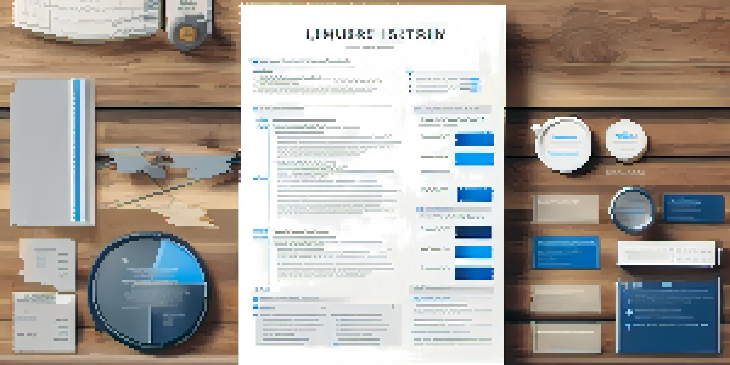
When it comes to visuals, not all elements are created equal. You want to choose images, icons, and charts that complement your information rather than distract from it. For instance, simple icons can be used to highlight skills, while graphs can illustrate your achievements, such as sales growth or project timelines.
Color is another important factor; using a cohesive color palette can enhance readability and make your resume look professional. However, be cautious with color choices—too many bright colors can be overwhelming. Stick to two or three complementary colors to maintain a polished appearance.
Visuals Enhance Resume Appeal
A well-designed resume with visuals can catch recruiters' attention and effectively communicate your skills.
Lastly, consider using white space strategically. This doesn't just improve aesthetics; it guides the reader's eye and allows them to absorb information at a comfortable pace. A cluttered resume can be off-putting, so ensure there's breathing room between sections.
Incorporating Infographics to Showcase Skills
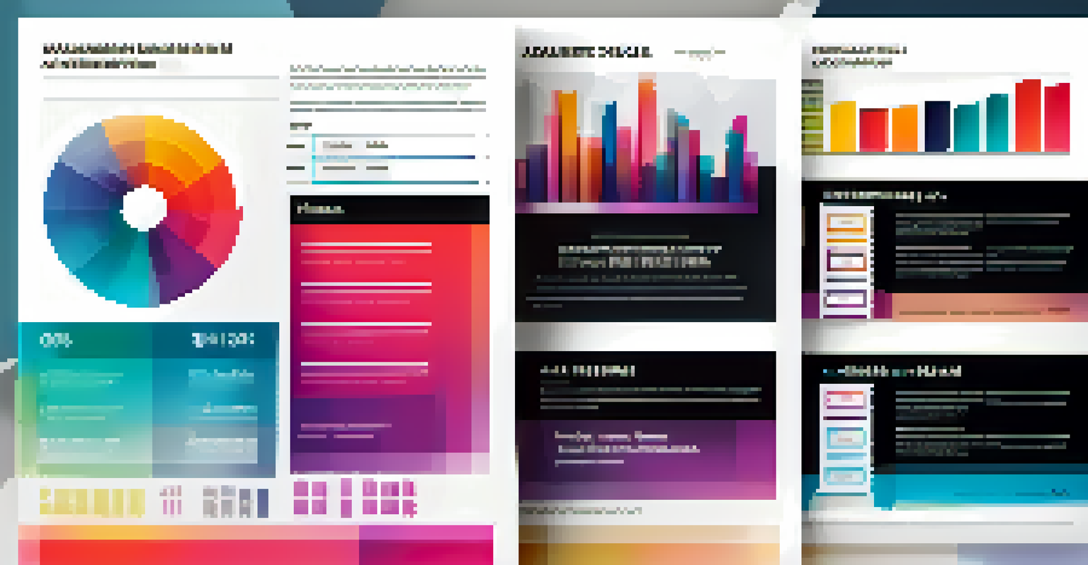
Infographics are a fantastic way to visually represent your skills and achievements. For example, instead of listing your skills in bullet points, you could create a skill bar or pie chart that visually demonstrates your proficiency levels. This method can make your qualifications more digestible and impressive at a glance.
Your resume is a marketing tool that showcases your personal brand.
When creating infographics, keep your target audience in mind. Tailor your visuals to align with the industry's expectations. For example, a tech-focused resume might benefit from sleek graphs and modern designs, while a creative industry could embrace more vibrant and artistic elements.
Remember, the goal of using infographics is to enhance clarity, not complicate it. Strive for simplicity and avoid overloading your visuals with too much information. The right infographic can highlight your strengths without overwhelming the reader.
Using Charts and Graphs for Achievements
Charts and graphs are powerful tools for showcasing your achievements in a quantifiable manner. Instead of merely stating that you increased sales, for instance, you could present a bar graph that illustrates the growth over time. This not only makes your achievements stand out but also adds credibility to your claims.
When including graphs, ensure they are easy to read and understand at a glance. Use clear labels and avoid complex data sets that may confuse the reader. The purpose is to provide a quick visual reference that complements your narrative, not to overwhelm with details.
Use Infographics for Clarity
Incorporating infographics can simplify complex information, making your qualifications more impressive at a glance.
Additionally, make sure that the data you present is relevant to the job you're applying for. Tailoring your graphs to reflect the skills and experiences that align with the job will create a stronger impact and show that you've done your homework.
Font Choices: Balancing Style and Readability
The fonts you choose for your resume play a significant role in its overall visual appeal. While you want to convey a sense of style, readability must be your priority. Sans-serif fonts like Arial or Helvetica are often recommended for their clean lines, making them easier to read on screens.
Mixing fonts can add a unique touch to your resume, but moderation is key. Stick to one or two font types—one for headings and another for body text—to maintain a cohesive look. Consistency in your font choices reinforces professionalism and clarity.
Additionally, pay attention to font size. Aim for a size that is legible without being overwhelming. Generally, a font size between 10 and 12 points for body text works well, while headings can be slightly larger to create visual hierarchy.
Color Psychology: Choosing the Right Palette
Color psychology plays a crucial role in how your resume is perceived. Different colors evoke different emotions; for example, blue is often associated with trust and professionalism, while red can convey passion and urgency. Choosing the right colors can align your resume with the message you want to send to potential employers.
Consider the industry you are applying to when selecting your color palette. Creative fields may allow for bolder colors, while corporate industries might require a more subdued approach. Researching company branding can also help you tailor your palette to fit the company's culture.
Choose Colors Wisely
Selecting the right color palette can enhance your resume's readability and align it with the industry standards.
Finally, ensure that your color choices enhance readability rather than detract from it. High contrast between text and background colors is essential for legibility. A well-chosen color scheme can make your resume visually appealing while maintaining professionalism.
Final Touches: Reviewing and Refining Your Design
After you've added all your visual elements, it's essential to step back and review your design. Look for any areas that may feel cluttered or confusing. A clean, organized layout can make a significant difference in how your resume is perceived, so don’t hesitate to refine it.
Consider seeking feedback from peers or mentors. A fresh set of eyes can catch inconsistencies or suggest improvements that you may not have noticed. Constructive criticism is invaluable in ensuring that your resume communicates effectively.

Finally, ensure that your visuals are appropriately formatted for the platform you'll be using. For instance, if you're submitting your resume online, save it as a PDF to maintain your formatting. Taking these final steps can help ensure that your standout resume makes the best impression possible.